5. Money Charts and Fibonacci
by M. Bourne
Candlestick Charts
Here is a chart of the Australian dollar's value against the US dollar for a period of several hours:
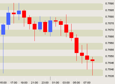
Chart source: FXTrek
What is going on in this chart?
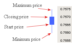
Each vertical bar represents one hour of trading. We can see the start price and finish price for each hour, as well as the maximum and minimum prices reached during the hour.
The blue candlestick means the price has gone up during the hour.
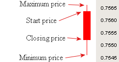
The red candlestick indicates the price has dropped:
You can see that in the chart at the top, several blue candlesticks together at the beginning of the chart indicate a strong rising pattern, while all the red ones in the right hand part of the graph indicate a strong downward trend.
Traders of shares and currencies (and many other things like commodities, precious metals, etc) sit glued to their computer screens watching these patterns. As the pattern changes (like in the middle of our chart above), they make buy and sell decisions, hoping to make lots of money.
Candlestick charting began in Japan in the 17th century as traders were trying to predict what the price of rice would do next. They saw price analysis in terms of a struggle between buyers and sellers, and who was in control.
Today candlestick charting is very important in technical analysis of price trends.
Lesson Suggestion - Money Charts
- Put students in pairs and get them to choose lots of different items that have constant price moves. They could be tea, sugar, coffee, oil, gold, silver, etc. Gather historical data on the item they have chosen and then learn more about candlestick charting so they can predict the direction of their market. Let them use Monopoly money and trade between themselves over a period of a few weeks to see who has learned most about prediction using charts.
Moving Average Charts
The moving average is another useful chart that is commonly used in trading. A moving average is calculated by taking the average of a fixed number of previous prices.
Example 1 - Moving averages
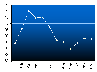
These are the prices (in US cents per pound) for Brazilian Natural Arabicas coffee in 2005:
Jan `93.63` Feb `106.11` Mar `120.12` Apr `114.48` May `114.96` Jun `107.23` Jul `96.56` Aug `94.98` Sep `89.48` Oct `94.4` Nov `97.96` Dec `97.57`
Source: International Coffee Organisation
A chart of this data shows some volatility (moving up and down a lot).
Using Excel, we can easily add a moving average trendline. I have chosen 3 intervals for this plot:
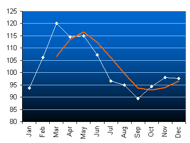
We can see that the moving average smooths out some of the volatility in the curve.
What is Excel doing for us?
The average of the first three prices (Jan, Feb, Mar) is
`(93.63 + 106.11 + 120.12)/3 = 106.62`.
The average of the 3 prices starting from February is
`(106.11 + 120.12 + 114.48)/3 = 113.57`
Can you see how the average has "moved"? That is, we are always taking an average of 3 prices, but each time the first price moves one along in the sequence of numbers.
The next average would be for Mar, Apr, May:
`(120.12 + 114.48 + 114.96)/3 = 116.52`
This table shows all the values that are represented in our moving average chart above.
Jan `93.63` Feb `106.11` Mar `120.12` `106.62` Apr `114.48` `113.57` May `114.96` `116.52` Jun `107.23` `112.22` Jul `96.56` `106.25` Aug `94.98` `99.59` Sep `89.48` `93.67` Oct `94.4` `92.95` Nov `97.96` `93.95` Dec `97.57` `96.64`
If we take more terms each time, the moving average becomes more and more smooth.
Interesting Stuff We Learn From Moving Averages
Currencies are volatile. The Australian dollar is one of the most heavily traded currencies in the world. Here is a chart of the Australian dollar (AUD) against the Singapore dollar (SGD) from 1990 to early 2006. For most of that time, the value of the Australian dollar has been dropping (from $1.50 to 84c just after the 9/11 attacks).
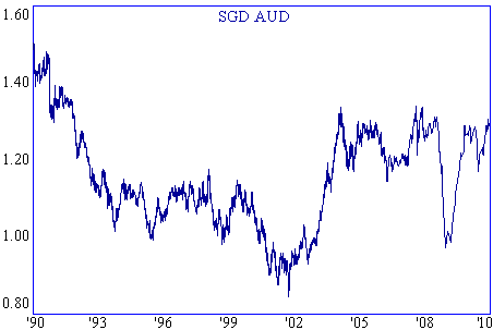
There has been a rapid rise in the value of the AUD since late 2001, mostly because of rising commodities prices and all the stuff Australia sells to China.
In early 2004 the price reached a 12-year high of $1.34 and since then it has trended sideways.
What can moving averages tell us about the future movement of the Australian dollar?
Here is a chart showing the 52-week moving average (red). Notice how it has smoothed out the volatility.
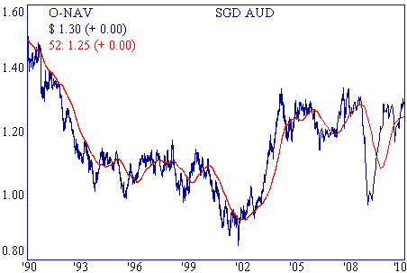
At times the daily price is clearly below the moving average (a declining trend, like in the first part of the graph) and sometimes above the moving average (a rising trend, like in the period from early 2002 to early 2004). This helps us to predict where it is likely to head next. (It indicates the current trend.)
How far will it go? No-one knows for sure, but it is interesting how often the Fibonacci ratios are valid, and how they can be used to predict future prices.
Fibonacci and Charting
We have seen the Fibonacci sequence before in Math Behind the Beauty. The sequence starts with 1 and each of the following numbers in the sequence is the sum of the previous 2 numbers. So we have:
`1, 1, 2, 3, 5, 8, 13, 21, ...`
This pattern occurs often in nature - and can be recognised in the financial markets as well.
A few important ratios arise from the Fibonacci sequence. If we take the ratio of a pair of large Fibonacci numbers (like 13/8 or 21/13 and keep going for large values in the sequence), we get the value:
Φ = 1.618
Other important ratios arising from Φ are:
`Φ − 1 = 0.618` , and
`(Φ − 1)/Φ = 0.382`
Why are they important? Because many analysts believe that the financial markets move up and down by multiples of these ratios and so they help in predicting the market.
Example 2 - Fibonacci
The lowest low in the AUD/SGD chart, just after 11 Sep 2001, was `84c`. Now `84c xx 1.618 = $1.36`. This is very close to the top that was reached in Feb 2004 of `$1.34`.
I'm not totally convinced about using Fibonacci for prediction, but it is an interesting issue to consider.